As an experience design specialist, I facilitate new
ways of thinking about innovation—putting people at the heart of highly complex enterprise and
customer systems.
Qualified professional
I am a certified Professional in Usability and User Experience (CPUX), with a
proven and in-depth understanding of international standards for human-system interaction
ergonomics, specifically ISO 9241-210.
Design innovation methods
I leverage my expertise in human-centred design methodologies to ensure that
user behaviours, context, and needs drive the design of fit-for-purpose services tailored to
real-world challenges.
Lean, iterative approach
I embrace an iterative, Agile mindset and learning approach at enterprise
scale for speed to market. I am a certified SAFe 5 (Scaled Agile Framework®) Practitioner.
Key capabilities
Strong advocate for the digital customer
Enthusiastic advocate for the user, drawing on customer stories,
insights, human cognition and empathy to guide concepts that meet users’ real needs.
Collaborating with business stakeholders
Co-design workshops and visual facilitation tailored to each
client and project, from a wide array of design thinking activities. Read more about my approach in the case
studies below.
Adding value with design toolsets
Broad portfolio of deliverables such as user research, personas,
user flows, wireframes, customer journeys, interface design and guidelines, usability
testing and report writing.
Backed by 15+ years in the creative industry with robust
knowledge of visual design, branding, design systems and their strategies, policies and
procedures. Design software toolset compromising of Sketch, Miro, Figma and Axure.
CASE STUDIES
A selection from my broad range of government and corporate
digital engagements—showcasing my versatility and the value I bring to
customers and clients.
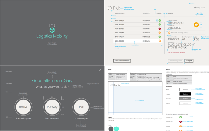
Oil & Gas Company
User-centred, task-focussed warehouse
logistics
Qantas
Improving employee purchasing
compliance
Energy Utility
Putting ‘power of choice’
in customers’ payment journeys
BP Australia
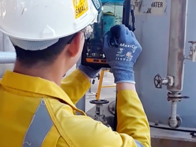
Mobile-enabled fieldworkers
Finance & Insurance
Digital claims concept
ATO
Quicker and easier superannuation
compliance
Commonwealth Bank
Digital options for internal audit
reporting
Defence & Security
Securing Australia’s border with
biometrics
Queensland Health
Designing a home quarantine compliance
service
Coming soon
Telstra
Mobile Device Management
Queensland Courts
Uplifting the experience of jurors
Coming soon
Title
Subtitle
IN GOOD COMPANY
I’ve designed digital products and services across all
sectors for many major Australian organisations, including those below, as well as for boutique and
start-up companies.
LET'S CHAT
I'm currently contracting with a large Australian telco
and happy to discuss your upcoming needs. Feel welcome to connect via email or LinkedIn
Mobility & logistics
Helping protect the ongoing success of
Australia’s LNG market leader, with better logistics operations for its
warehousing and distribution.
A tool focussed on fewer things done
well.
Oil and gas company with global logistics operations at high risk of supply chain
disruption from paper-based methods.
The company’s critical functions of warehousing and distribution were impacted
by time consuming and error-prone paper-based methods. These methods posed ongoing
risk to the client’s supply chain by creating a lag in materials tracking,
document control issues, slow stocktaking and data entry errors.
The project would be the company’s second attempt to modernise their warehouse
processes with a workable product. A previous, costly handheld device had taken many
years to develop. It suffered from poor usability when finally deployed, resulting
in low uptake. In addition, its software was also difficult to upgrade, ultimately
forcing the company to revert to its paper-based ways.
Back to basics to ensure real change
This
solution would be different. I set out to ensure it would be user centred and
task focussed. As UX Lead, I collaborated with the company’s Material Lead, my
project team and the warehouse team to firstly understand the business problem
and user needs, then transform key warehousing activities through the design of
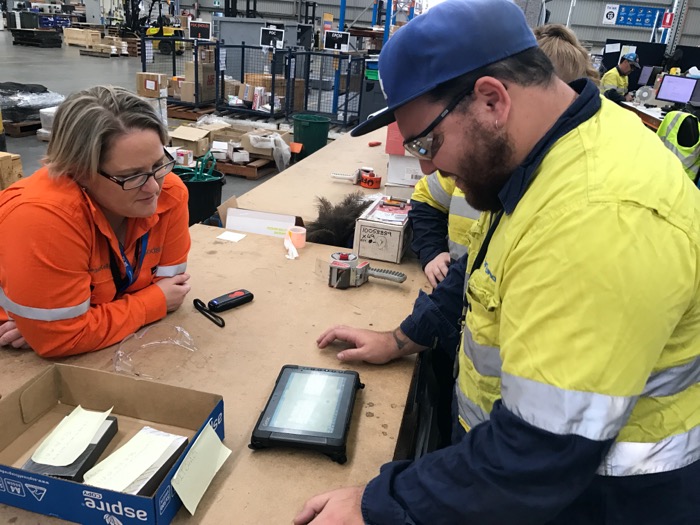
a fit-for-purpose tablet application.
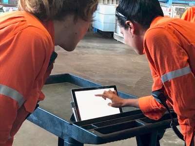
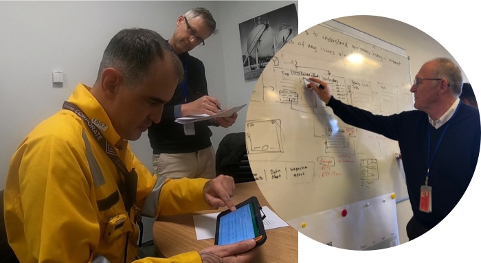
A key stakeholder observes usability
testing.
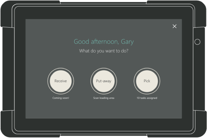
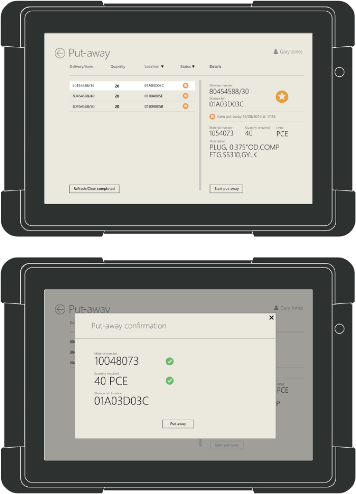
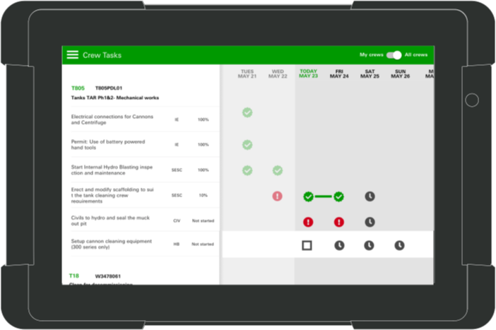
Warehouse-fit in five weeks
There was a very short timeframe of five weeks to develop a solution that would
accurately assist users to perform the critical warehousing activities of
‘receiving’, ‘putting away’ and ‘picking’. It
was to be delivered on a ruggedised ‘Getac’ mobile device, as the tablet
needed to be robust as well as ergonomically sound for repetitive work. The solution
was limited to a Windows Tablet UI as the endorsed enterprise mobility platform.
Another important project consideration was that the interface did not interfere
with the user’s ability to maintain awareness of potential hazards while using
the device in a high-risk work environment.
Observing user behaviour: work as done v work as prescribed
Company analytics indicated that human error was a key source of fulfilment issues.
Firstly I undertook contextual enquiry, observing target users (Logistics Operations
warehouse staff) undertaking their work, during tasks from unpacking and counting
received goods into the warehouse, to storing and recounting into designated bins. I
witnessed their current challenges and behaviours around paper-based methods. I
talked through the task pressures of busy stocktake cycles, recording materials
manually then transferring handwritten data into an Enterprise Resource Planning
system. I noted deviations between how users recorded data, such as marking counts
outside of the printed table.
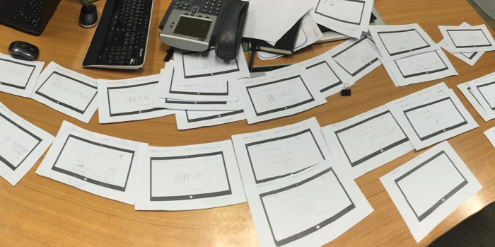
Interface sketches for receiving,
putting away, and picking.
Hypothesising a fit-for-purpose design
Insights from enquiry called for an experience that would be highly assistive and
versatile to meet the accuracy requirements of the business, while meeting user
needs such as visibility of display, situational awareness and accommodating gloved
use.
I reasoned that a task-focussed, ‘inductive’, interface consisting of
instructions and input fields in a window floating above their task list, would be
the optimal way to guide users through the required steps for various tasks. This
would avoid the risk of accidentally tapping other features that might break the
flow. I put forward the potential of a high-contrast interface with large elements
to deal with the challenges of light and gloves.
Validating ease of use
It is important for the UX professional to validate hypothesises early and test
frequently with users in order to understand what works and what doesn’t work,
and improve if necessary so the product is successful when it is released. I set up
one-on-one sessions, where warehouse team members were given a functioning tablet
prototype with a counting activity and asked to “think out loud” as they
completed tasks. The activity involved selecting a material from a “pick
list”, scanning the material barcode, verifying that the correct item was
scanned, and then entering and confirming the quantity counted.
This testing allowed me to observe their understanding of the interface. The first
round of testing yielded high task-completion rates averaging 80%, with users
clearly understanding what was required of them from the ‘inductive
interface’. Feedback from the test sessions included comments such as
“Easy enough to work out without being told”.
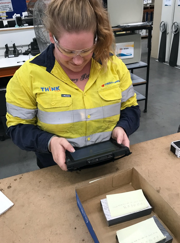
Prototypes were usability tested with
at least five users.
Observe>validate>refine>test>>
Observing behaviours in the first testing round also helped identify potential
refinements, including:
improving the visibility of important primary action buttons by increasing
their size and using solid colour (instead of an outline);
improving calls-to-action with more assistive language, such as renaming a
“Rescan” button to “Let me scan again”;
removing unnecessary confirmation screens to decrease repetition and task
completion times; and
reconfiguring the numerical virtual keypad to match the physical keypad
layout.
These refinements were incorporated into the prototype, tested in a second round,
and strongly validated.
A style guide was created for
developers to reference.
The prototype was tested on a
rugged Windows Tablet.
Assured acceptance based on real user needs
My thorough and careful methodology ensured the company’s investment in the
tablet device program rollout was assured by validated, real user needs and
demonstrated acceptance before development.
The product was successfully implemented on time and on budget, facilitating a
smooth shift from paper-based to real-time warehouse processes.
Client
Oil & Gas Company, Perth
Tools and methods:
Contextual enquiry, task flows, paper prototyping, wireframes,
Sketch+Invision prototype, usability testing, and style guide.
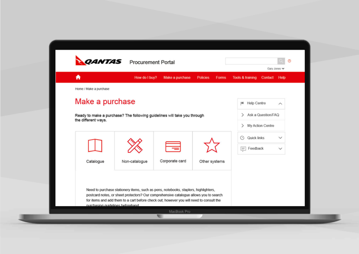
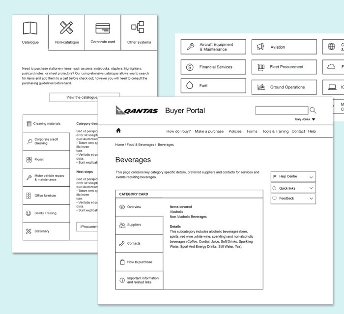
SPEND AWARE
Procurement portal helps turn around iconic Australian
brand by improving purchasing compliance
The procurement portal needed to meet
world-class branding
An ambitious cost-control program to reduce non-compliant spending by $2.1B
Up to 90% of the airline’s indirect purchasing was being made without approved
purchase orders, and lack of centralised information about correct purchasing
procedures hampered proper oversight of spending. High enquiry rates to the
procurement service desk indicated that the current systems were not meeting the
needs of employees.
After recording a billion-dollar loss, the company launched an ambitious cost-control
program, aimed at reducing operational costs and non-compliant spending by $2.1
billion.
A procurement portal would be a key initiative of the program, aimed at delivering
cost savings of $154M by 2020 by providing greater control and increased
transparency of expenditure.
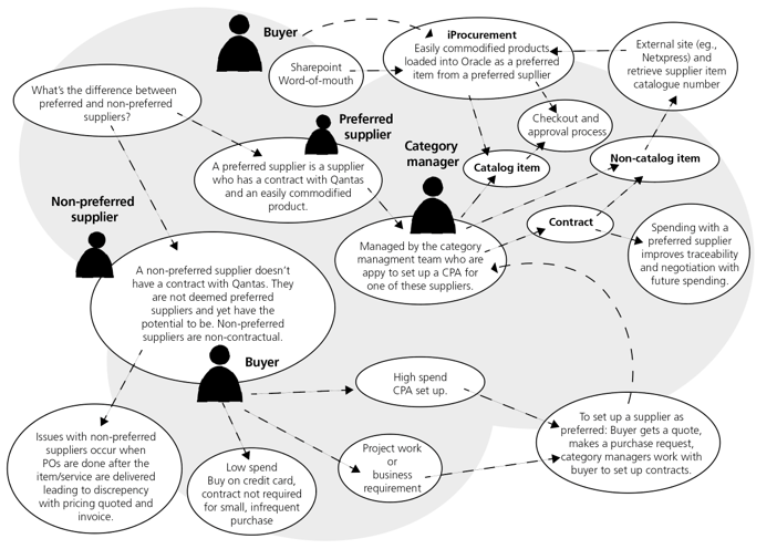
A broad user group
In moving
the company’s procurement activity to a centralised model, the portal’s
users
would be staffed from all areas of the company, representing a wide variety of
backgrounds and skillsets, as well as external users such as suppliers.
Mapping the airline's spending
processes.
Managing the functional design of a self-service experience
The portal was to be browser-based and largely accessed with desktop devices.
Building from off-the-shelf software, it would need to clearly direct requestors and
procurement personnel to the appropriate buying channels, policies, help requests,
training guides and category-relevant purchasing information.
As the Portal Design Architect, I was responsible for determining and meeting user
needs and business requirements for an intuitive, self-service experience, which I
then captured in a functional specification document for handoff to an offshore
development team.
My approach
The selected platform had a dated user interface and
legacy HTML and CSS, which would require signficant visual uplift to create an
acceptable and modern experience for airline personnel. Given this, during my
discovery work I included an early focus on gathering internal branding information,
as well as looking to identify existing in-house work on personas or other UX
research to help underpin the project.
Category cards and navigation helped
users find the relevant policies.
A blank canvas
As well as gathering user/business needs with a variety of enquiry methods, my
research also uncovered—despite the company’s strong and well-documented
design language systems for external applications—there was almost no
provision for interface guidelines, principles or design language systems for their
internal enterprise systems.
Leveraging strong external branding to support purpose-driven compliance
I decided to approach this gap as an opportunity to develop a simple, modern
enterprise interface design for the portal in the spirit of the airline’s
consumer identity. Aligning the portal design solution with the airline’s
external branding also allowed the user experience to be further driven by
perception and engagement with corporate identity and work culture. Usability
testing found that users identified positively with the corporate branding. I
hypothesised that compliance using the portal would be assisted by appealing to user
identification with the company's mission.
I created a lean portal style guide, as part of an extensive functional
specification. This ensured comprehensive guidance for the offshore frontend
developers to deliver the solution as intended, despite the absence of internal
design language system.
$38M in benefits over five years
The purchasing portal received a company award for innovation, and the programme
itself was recognised with an industry award. The airline’s return to profit
in 2015 was one of the biggest turnarounds in Australia’s corporate history,
with the procurement program significantly contributing to the airline’s
return to profit by bringing $38M in benefits over five years through improved
spending monitoring and supplier management.
Client:
Qantas, Sydney
Tools and methods:
Contextual enquiry, task analysis, user flows, wireframes, Adobe
Illustrator, Axure prototypes, and style guide.
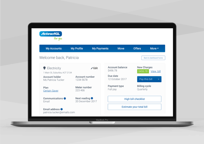
Digital Basics
An energy portal experience that empowers the customer
The power of choice
Responding to government reforms to the national electricity market with a
user-centered customer payment portal shaped by comprehensive design-thinking
workshops.
The “Power of Choice” government-led industry-wide reforms to the
national electricity market aimed to let Australians make more informed choices
about using electricity products and services.
Developments such as the introduction of ‘smart meters’ were changing
customers’ expectations, behaviours and loyalty patterns. The client, a large
energy utility, was seeking new market growth opportunities in response to these
regulatory and consumer shifts.
However, it was identified that customers needed more support at critical stages of
their energy journey. The company was maintaining a legacy self-service platform,
and internal data showed an over-dependency on their call centre for low-complexity
customer enquiries.
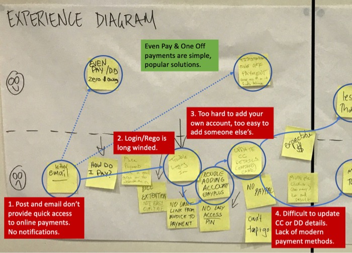
Capturing customer journey pain
points.
Customers needed to exercise their energy choices in quick and simple online
journeys
Understanding customer needs was crucial for the client to maintain their position as
the largest utility in their market. The utility embarked on a digital
transformation initiative, ‘Digital Basics’, to improve customer
experience while reducing cost-to-serve.
The design of a new customer payment web portal was a key part of the Digital Basics
program. The new portal would service the utility’s new and existing energy
customers—providing them with more control and choice over the way they use
electricity and a way to self-service as quickly and conveniently as possible.
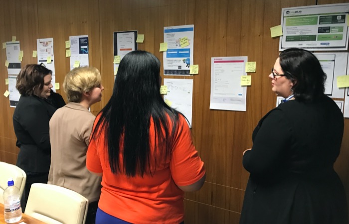
A competitive analysis activity with
business stakeholders.
Taking stakeholders on a human-centred design journey
As Experience Design Lead, I was tasked with managing the design of the new customer
payment portal. This project would call for a significant boost to the company’s
digital service maturity, so involving and guiding company stakeholders along the
way was a focus of my work.
I scheduled a program of two-week agile sprints, each with a human-centered design
(HCD) cycle of ‘empathise, define, ideate, prototype and test’.
I planned out a series of initial HCD workshops for a diverse range of stakeholders
from marketing, customer-service and business-development. To provide a solid
evidence base for the workshops and inform insights, I gathered and analysed Google
Analytics data for the existing portal, call centre feedback data, and undertook
user observation and interviews.
In designing the workshops, each was based around a different customer journey per
sprint, for example, ‘paying a bill’, ‘moving house’, ‘updating personal
information’. To facilitate HCD awareness and build rapid understanding of customer
needs and business requirements, I used a mix of affinity diagramming, problem
statements, empathy mapping of personas and value proposition activities. These
tailored and systematic ‘deep dives’ identified painpoints for each journey, and
allowed valuable insights and ideation through guided empathy.
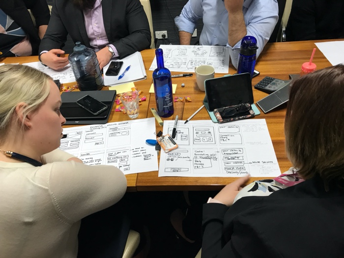
Team and stakeholder solution
sketching.
Maintaining stakeholder engagement over a long-term project
As the project progressed, stakeholder participation was affected by competing time
pressures and perceptions that continued attendance at workshops wasn’t
critical, once they became familiar with HCD processes. I incorporated some
different ideation tools to mix up the workshop formats, and promoted wider interest
in the project’s HCD stream by keeping workshop artefacts on display in one of
the main meeting rooms—generating effective curiousity.
I developed a set of project principles to guide more user-focused decision making.
This built consensus amongst stakeholders as to an agreed direction and vision for
the project. I also created a collaborative Principal Design Team, to ensure at
least one member from the team attended each workshop and reported back. This
created efficiencies and ensured continuity in understanding decisions made
throughout the project.
These responses protected the crucial ‘buy in’ of ongoing particiption, and helped
the project stay on track.
Building, testing and branding based on real user needs and wants
Each workshop informed the development of prototypes, for which the UX team used
‘clickable’ prototyping software, providing a highly tangible starting point for the
development of feature sets and user stories. These interactive prototypes were
regularly tested with customers and iterated on to ensure continuous improvement of
the service, before being finalised for development and deployment.
I also devised and ran branding workshops as part of the visual design component, to
build an understanding of the brand, its personality, customer perceptions, and
undertake competitive analysis with stakeholders to build consensus about the best
approach to the look and feel of the portal that their customers would instantly
associate with their branding. While leading my own design team, I collaborated
closely with the technical and development teams, to ensure the proposed design in
combination with Sitecore and Microsoft Azure cloud services would meet end-user
expectations.
The new portal received a customer
feedback rating of “Very satisfied”.
The Power of Choice – realised with co-benefits
As intended, the new customer portal moved low-complexity payment, billing and
account call enquiries to a low-cost digital channel. The comprehensive HCD process
was reflected in significant customer and business benefits, including:
the average ‘pay bill’ visit time was cut by 90%, going from five
minutes to 30 seconds, and achieving an average customer feedback rating of
“Very satisfied”;
48% of call centre traffic moved to the digital channel;
ease of ‘move-in move-out’ transactions for users reduced customer
churn; and
providing customers with the online tools to view and monitor their power usage,
supporting the ‘Power of Choice’ reforms.
Co-benefits of the project included the company’s successful introduction to
Agile, all the technical benefits of Sitecore/Azure cloud services, and embedding
HCD capability to support a new customer-centric focus going forward.
Client:
ActewAGL, Canberra
Tools and methods:
Usability review, competitive analysis, sprint personas, customer
journeys, design thinking workshops, value proposition canvas and
ideation and branding workshops, Adobe XD, Sketch, and Invision.
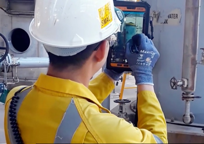
Intelligent operations
Rapidly demonstrating how to make oil refinery
maintenance more cost effective with customised devices and wearable technology.
An early MVP established the viability
of using tablets in the field..
Targeting the administrative pain-points of in-the-field workers
BP was seeking to remove inefficiencies in the field, such as the need to complete
maintenance administrative tasks offsite, which impacted the time refinery field
workers had in the field supervising work and managing task execution times. The
company’s “Connected Worker” vision was progressed as part of an
‘Intelligent Operations’ initiative, aiming to improve productivity by
providing relevant and timely information out in the field to support maintenance
task execution.
Supervisors knew that their time could be better spent in the field rather than
continuously returning to the refinery control centre for minor administrative tasks
such as clarifications on scheduling, equipment information, monitoring the progress
of upcoming tasks, resubmitting permits to ensure continuity of access to the
refinery, signing off on the completion of work and completing timesheets.
Maintenance field workers’ pain-points included losing “work
packs” (paper-based task information) during shift handovers, reviewing job
histories, processing a high volume of safety permits (to control entry to
restricted areas) and delays in other teams having knock-on effects to their own
work.
Observing desktop and paper
maintenance task and scheduling processes.
Equipping field workers with mobile inspection technology
To bring the “Connected Worker” concept to life, a pilot was established
as a short and rapid test of viability. An agile approach focused on two streams: a
“hands-free” wearable for inspection work, and an equipment look-up and
scheduling tablet application. I was given the dual roles of interaction designer
and visual designer for the tablet design system within a team of ten people over 12
weeks across the two streams.
The target tablet was a ruggedised Samsung model running Android OS. The tablet
application would support frontline leaders and supervisors who managed day-to-day
maintenance activity, overseeing contractors and managing crews. Their regular
administrative tasks normally done at a desktop were to be enabled in the field with
the tablet application. A minimum viable product (MVP) feature set had been
determined in discovery workshops run prior to the project’s start. The
features identified were:
Crew scheduling—displaying the schedule of tasks to be performed by
different crews on the same piece of equipment and understanding knock-on
effects of delays.
Requesting permits—requesting permits in the field in response to schedule
delays, ensuring continuity of access the the site. View task
details—reviewing details of the maintenance being performed while
overseeing the quality of execution and safety.
Scan equipment—viewing and validating critical details about plant items
including service history, current work tasks and technical data sheets.
Trends in interface design were
collated as a design reference.
The interface enabled crews to assess
delays with upcoming work.
Technical considerations influencing my UX approach
One constraint limiting the interface’s design was the app development platform,
Xamarin. While it can provide benefits such as speed to market and code sharing
across Android and iOS platforms, it is sometimes chosen for the wrong reasons such
wanting to leave options open for moving platforms. This can negatively impact end
users, as the choice of interface components and level of customisation is limited.
Another constraint was that the company had little in the way of its own UI
guidelines, and what they did have was heavily derivative of Google’s and Apple’s
standard interface guidelines.
Given both of these constraints, I chose to use stock Android design system (Google’s
Material Design), in order to get the application up and running quickly as the MVP
only needed to prove that connectivity with a device could be achieved on site and
that tasks could be progressed remotely in the field as there would be little time
to develop a custom design system from scratch or customise it. Google’s Material
Design is a highly prescriptive design system which details the size, color,
spacing, and other aspects of how screen views and layouts should look and behave
largely unified across iOS and Android. Clickable prototypes were developed using
Sketch and Invision for testing frequently with a set group of very experienced
field supervisors.
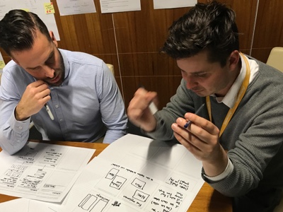
Usability testing and mapping process
flows with a stakeholder.
Mapping the user's journey
To firstly understand an end-to-end maintenance routine for maintenance supervisors,
I undertook a “day in the life of” journey-mapping exercise. I shadowed supervisors
in the field to understand the software and tools with which they were currently
managing their work. I then worked with a business analyst and project team SMEs to
map process flows—to better understand processes being observed in the field.
This research was undertaken to guide my design of a sequence of screens that would
enable the user to complete the tasks in scope and define the scenarios that would
be tested with users using a clickable prototype. Feedback from the prototype would
be used to iteratively improve the interface to ensure it would be fit for purpose.
Designing for light and dark conditions
What I discovered from the observation and testing sessions was that the application
would be used shifting between greatly contrasting lighting conditions—from
distillation towers and cracking units in full sun to dark waste tanks and cramped
access shafts—and viewed through sunglasses, prescription glasses and safety
goggles.
Through this discovery, I identified the need to increase contrast, as bright ambient
lighting reduces contrast, bump up the typefacesize, and avoid relying on colour by
using icons to enhance the meaning of text. While the brightness of light user
interfaces can cause discomfort in dark viewing conditions, the lower contrast of
dark interface themes are harder to read in bright light, therefore the default
should be light-themed user interfaces. This also improves visibility through
sunglasses, while high contrast improves definition for workers wearing glasses. An
option to toggle between states would improve the accessibility and add flexibility
to the overall user experience.
Successful proof of concept
My team and I delivered an on-time proof-of-concept model, which successfully
demonstrated an effective and user-accepted prototype that enabled a range of key
tasks to be undertaken in the field and improved work order execution rates. I also
provided recommendations to guide future stages of the Connected Worker initiative,
including best practice for variable lighting conditions (see box) and the following
points.
Develop a simpler design language system using a mobile development platform
that would allow far greater customisation for the robustness needed for bright
conditions in the field and the use of heavy safety gloves.
Provide design options in both landscape and vertical for smaller devices, such
as phones.
Develop functionality for onboarding users with a simple ‘guided
tour’ overlay interface.
Continue to iterate designs based on feedback, refine and retest design,
ensuring that end users are involved in providing feedback.
Best practice for designing in light and dark conditions
A light (black foreground on white background) user interface is needed for
its contrast as bright ambient lighting reduces contrast.
Increasing contrast also makes text appear larger than it is in comparison
to dark user interfaces.
Font size and weight should also to be increased for outside use.
Colour contrast can be increased by increasing saturation.
Avoid relying on the language of colour; support meaning with other graphic
devices such as weight, icons and density of solid lines.
While the brightness of light user interfaces can cause discomfort in dark
viewing conditions, the muted lower contrast aesthetic of a dark UI will be
harder to read in bright light.
Shades of grey should be avoided as they will be washed out.
Solid lines should be used to separate areas of text rather than muted
backgrounds.
Old monochrome devices and applications can provide inspiration for
designing high contrast UIs.
Using functional graphics in addition to colour will maximise accessibility
as a side benefit.
Test across different types of tablets as different brands and models have
varying screen brightness levels.
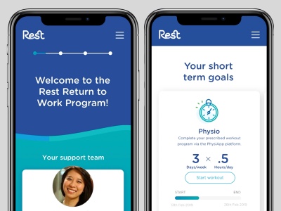
A staged and rewarding approach to rehabilitation.
A national insurance company was seeking to make a strong bid to continue
underwriting insurance products for one of
Australia's largest superannuation funds. The super fund required the
successful tender to increase the uptake
in return-to-work rehabilitation services by 18% within 12 months, in addition to
other conditions.
The existing service was clunky,
heavily administrative, and over reliant on emails.
High stakes bid to increase uptake of return-to-work rehabilitation services
Accordingly, the insurance company was seeking to uplift their existing
return-to-work services, to drive scalable,
sustained and effective user engagement. Ongoing engagement with rehabilitation
support over weeks, or often months,
helps drives successful return to work outcomes, which directly affect the
fund's bottom line.
However, as users of the service, claimants were struggling to complete tasks, such
as providing documentation and
updates.
For case managers, the process was painful; systems were clunky, and tasks heavily
administrative and time consuming.
There was an overreliance on email for client interactions, which didn't
reliably integrate with the
company's claim management system. This impacted case tracking, further
increasing the burden on claimants.
Difficulties with recording phone interactions compounded these challenges.
A digital service concept for supporting returning to the workforce
My design team was tasked with rapidly developing digital service concepts as part of
this multifaceted bid. The
project spanned two weeks, during which we worked on-site with the client. Our
design squad consisted of two visual
designers, and myself as the user experience designer. Together we explored and
developed potential user experiences
to be presented as part of the bid.
We needed to thoroughly understand the insurance company's current
return-to-work and return-to-wellness
services, as well as the obstacles preventing claimants from utilizing these
offerings.
Extended time away from work can exacerbate mental health challenges, further
increasing the difficulty of
re-entering the workplace.
A gradual, rewarding approach to rehabilitation helps build trust with claimants, who
often harbor distrust towards
life insurance companies.
As a team, we mapped out the typical journey of wellness and return to work to
identify key customer touchpoints and
address where drop-offs occurred in the service. This analysis guided our daily
“design studio” sessions with
stakeholders, where we mapped the claims and return-to-work journey in detail.
Since 90% of the company's claim submissions were made through their mobile
app, and the success of their
popular meditation app, we quickly focussed on a mobile app as the most suitable
platform for claimants on
return-to-wellness and return-to-work programs.
The app needed to facilitate rehabilitation, foster communication with wellness
managers, remind users to complete
their rehab activities, keep them informed of their progress, and reassure them of
continued payment throughout
their recovery.
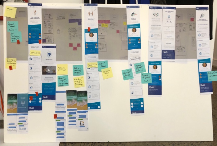
6-up encourages rapid ideation,
allowing the team to explore a wide range of UI
concepts.
Using the 6-up method for quick ideation
To ideate rapidly in order to meet afternoon updates with the client, we employed the
6-up method, a quick ideation
technique often used in UX design to generate multiple user interface solutions for
different stages of the customer
journey.
The 6-up method is a quick ideation technique in UX design that helps generate
multiple UI concepts for each stage in
the customer journey (see box).
The method creates a dynamic environment where designers can freely experiment with
UI concepts through both
individual and group activities. Through the iterative nature of the process, the
best ideas are continually
enhanced, driving innovation and ensuring that the final design is a robust,
well-rounded, and collaborative effort.
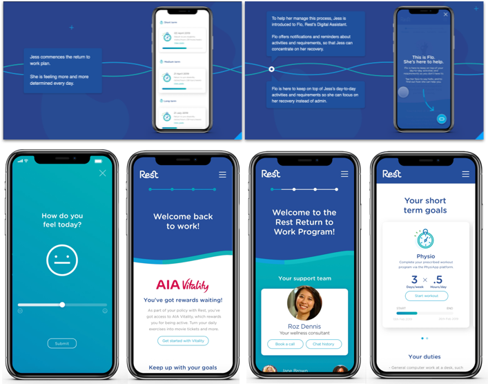
By using the 6-up method, I discovered:
a variety of solutions: 6-up encourages rapid ideation, allowing the team to
explore a wide range of UI
concepts, some of which may be unexpected or innovative, for example, one
concept involved a simple daily
interaction—“How do you feel today?”—designed to help track the
claimant's mental health in a friendly,
intuitive and non-intrusive way.
collaborative insights: reviewing and building on each other's sketches
fosters collaboration, helping uncover
new perspectives or approaches not considered on your own.
enhanced ideas: through “stealing” and improving elements from
others' sketches, the best aspects of
multiple concepts can be combined, resulting in a more refined, creative
solution such as an activity center
that confirms her claim has been submitted, provides information on what will
happen next, key contacts and free
wellbeing resources.
user-centered focus: the iterative refinement process, especially when tied to
specific stages of the customer
journey, helps ensure that the design addresses key user needs and pain points,
such as focussing on energy on
treatment by having the app manage appoints and claimant admin.
rapid feedback and iteration: the quick cycles of sketching, reviewing, and
refining accelerate problem-solving,
helping you identify what works best through constant feedback and improvement.
The 6-up method is a quick ideation technique in UX design that helps generate
multiple UI concepts through both
individual and group activities such as:
six frames, one sheet: designers are given a sheet divided into six boxes to
sketch six different UI ideas
in a short time (5-10 minutes), focusing on key concepts
group review: after sketching, the team reviews the ideas, discussing
strengths and weaknesses of each
concept
stealing and improving: during the review, designers are encouraged to
“steal” and improve elements from
others' sketches, fostering collaboration and innovation
iterative refinement: designers integrate elements from different 6-up
sketches, fleshing out the design in
subsequent iterations. This collective, iterative process leads to a more
robust and creative final solution
than any individual sketch could achieve alone.
Tracking UI design development from
6-ups and wireframes, to the final visual design for each stage in the claimant
journey.
Insights applied
The best ideas from the 6-up sketches were selected and combined into a more cohesive
concept for each stage of the
claimant's journey, addresses the needs identified in each stage of the
journey.
The visual designers brought the UI concepts to life, focussing on aesthetics such as
layout, typography, colour
schemes, illustration, and brand alignment, while maintaining the core user
experience principles established in the
ideation phase.
The interface designs underwent several iterations, with daily feedback sessions
between UX designers, visual
designers, and stakeholders. Involving stakeholders early and frequently gives them
ownership and, importantly,
buy-in and acceptance.
The bid outputs demonstrated a
tangible and compelling way
forward to increase uptake and engagement in return-to-work processes.
A compelling bid
Once the visual designs were finalised, my team applied them to interactive
prototypes, which simulated key stages of
the claimant's return-to-work journey from the user perspective.
By showcasing the transformative potential of a mobile app in this way, the bid
showed a tangible and compelling way
forward to increase uptake and engagement in return-to-work processes.
These two weeks provided a strong foundation for the next stage of prototype testing,
to gather user feedback on
usability, flow, and engagement (for a prototype testing case study, see this other
one).
Client:
Insurance company, Melbourne
Tools and methods:
Process flows, human-centred design, user journeys, wireframes, custom
illustration, visual design, style guide
FUTURE TRAVELLER
Supporting seamless border crossing experiences.
Low fidelity concepts made users feel
involved at the inceptive stage of the project..
Building a modern traveller-clearance system with scalability and security
The ‘Future Traveller’ initiative sought to transform Federal Government
travel services, including processing of complex border movements for a more
seamless traveller experience. This was primarily in response to a forecasted
increase in traveller numbers through seaports and airports, in a context of
ever-evolving security threats to Australia.
An early proof of concept had demonstrated the feasibility of replacing a number of
legacy ICT systems with a more automated and intelligent business model as part of a
wider modernisation push. This case study takes a look at the next stage, which
progressed the early proof of concept.
A range of observation tasks were
undertaken of border officers at work..
Better enabling risk-focussed user activities
The agency needed improved support for the management of critical border monitoring
and processing activities of frontline employees. These users included Action and
Response (A&R) officers with dogs roving luggage pickup areas for suspiciously
acting travellers, baggage officers inspecting and interrogating travellers tagged
by A&R officers, and border officers clearing ship arrivals in remote locations.
The agency wanted to reduce staff time spent on less significant and highly manual
duties, such as attending to paper ticket jams at passport gates, to better enable a
risk-based compliance approach.
However, there was already one high-fidelity proof of concept, which had been
developed without end-user feedback. The agency needed to undertake retrospective
user discovery to identify any gaps or issues in the experience that needed
consideration, as well as address the lack of ownership from not involving users
from commencement.
Improving frontline staff experience with mobile devices
I was tasked with undertaking a four-week discovery phase as product designer, to
establish what needed to be done to the existing improve frontline staff experience
with mobile devices, and identify any revisions needed in the existing proof of
concept. Some of the procedures identified for device-based assistance were:
real-time processing, assisted decision-making and biometric assessment of
digital passports at borders (land, air, sea);
flagging and increasing awareness of the arrival of known persons of interest;
and
upcoming task alerts allowing users to focus on monitoring security and safety.
Preparing for user observation
To start, I engaged with technical and business stakeholders to understand the
technical aspects of the proof of concept, map the key user activities for
observation and evaluate the proof of concept’s task suitability. This
preparation would maximise understanding in the limited time available with users,
as well as strategise an observation plan.
While users could have been presented with the proof-of-concept for feedback, there
was a risk they might respond negatively to its ‘finished’ appearance.
Alternatively, with a low-fidelity approach—indicating an earlier
stage—users were more likely to feel motivated and less inhibited about giving
feedback, as well as feeling more ownership of the end solution.
In addition, low-fidelity prototypes tend to support quicker turn-around times on
design changes, saving time for high-value activities such as exploring other
options. With this in mind I re-created a clickable prototype incorporating
best-practice heuristics.
Mobile usability in context (concept courtesy of Giant Ant).
A wide range of operating environments
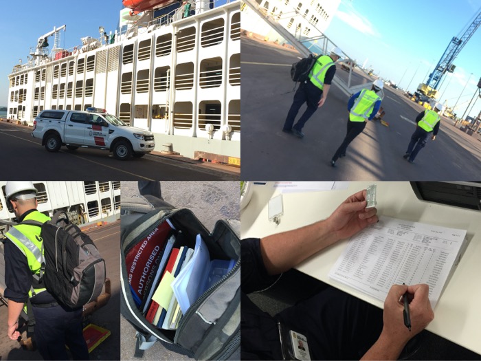
User observation with the prototype was undertaken over three days in and around
Darwin. The location was selected for its wide range of operating environments. It
offers small, large and remote operations with officers undertaking a multitude of
travel-clearance duties in a variety of environmental and physically challenging
situations such as at major and regional airports, cruise ship terminals, as well as
commercial vessels and pleasure craft, and remote air landing locations—with
varying states of wireless connectivity.
Observing users in the field would provide further inputs into optimising the
design, potentially capturing contexts of use and additional insights not previously
considered by business stakeholders.
Discoveries in the field
Border officers perform similar border processing tasks, yet in greatly varying
environments and contexts. For example, an A&R officer needs to be able to track
moving targets and tag them quickly and covertly in an airport, in poor lighting
with high ambient noise level while regularly interrupted by border gate issues.
Moving to a different extreme, boarding a gas tanker involves a hazardous environment
requiring different considerations, such as the use of intrinsically safe devices.
All activities would require a highly optimised and seamless user experience to
efficiently complete the task at hand without creating user overload and adding to
safety hazards. As the original proof of concept would not meet these requirements,
I made recommendations for improving its experience according to insights gathered
during observation.
Handing over
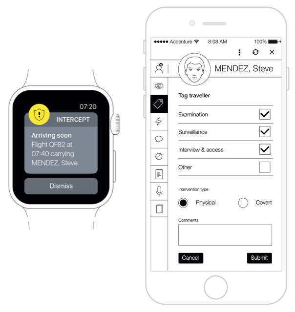
In presenting the observation findings, I introduced an additional solution—an
option involving a synched wearable. Pairing the main device with an Apple watch
allowed for focussed alerts to the user in a more convenient and timely manner. User
testing was to roll out under a separate contract, so I ensured the next team had a
comprehensive handover.
This handover included a comprehensive written report on best practice UX for
workforce mobility devices. My report documented a framework, principles (see box
below) and detailed specifications designed for the agencies operating requirements,
which then helped guide the program of work with a UX-first approach.
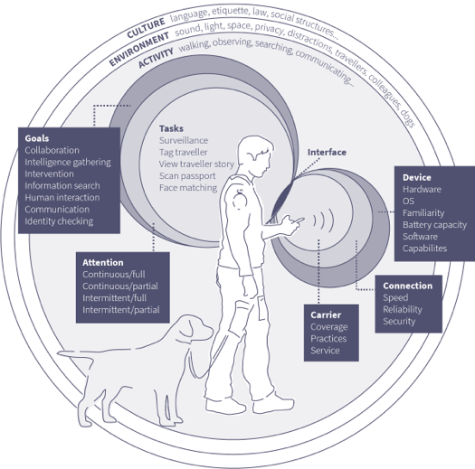
Nine principles for designing and evaluating good mobile experiences in
border-control workplaces.
Streamline tasks for increasing productivity by only focussing on what users
need to accomplish out in the field, versus tasks they are likely to tackle
on a desktop or laptop. This ensures that the mobile versions aren’t
just a stripped-down experience, i.e. “Mobilise, don’t
miniaturise”.
Assist user input by displaying default values or prefilled values wherever
possible. Offer alternate input mechanisms, especially for smaller devices,
by taking advantage of the device’s capabilities such as voice,
motion, camera, gyroscope, and geolocation.
Design for suitability for the task. Larger screens such as tablets should
be used for high-volume processing, such as cruise-ship border processing,
while smaller devices should be used for covert tagging activities.
Flatten information architecture by making the most important functionality
accessible in as few gestures as possible and prioritise them according to
need and frequency of use. Navigation for small screens is commonly broad
and shallow instead of deep. For example, semi-transparent modal windows
keep the main screen in the background assisting the user to locate where
they are.
Prioritise content in a vertical hierarchy according to the most important
for the task at hand.
Design for ‘glanceability’ and rapid scanning.
‘Glanceability’ refers to how quickly and easily the visual
design conveys information.
Optimise the application by increasing perceived speed by delaying tasks
that the user doesn’t need yet, while predicting and preloading the
steps the user might take next.
Optimise the user interface for visibility in bright lighting conditions, by
paying attention to design elements such as contrast, colour, typography and
font size. Increasing screen brightness may increase battery usage. Using a
glare guard and non-reflective screen protector may improve visibility.
Reduce physical fatigue by providing additional hands-free enhancements or
smart-watch integration for alerts and covert tagging. Enhancements reducing
the amount of time required to handle the device puts less stress on the
user’s fingers, wrist, shoulders and neck.
Client:
Federal Government Agency, Canberra
Tools and methods:
Contextual enquiry, task analysis, user flows, wireframes, Sketch App,
and Invision.
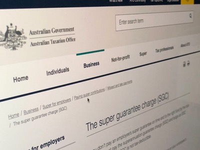
Guaranteeing super
Improving outcomes for employees
and employers by delivering a digital service to improve industry compliance over
resolving late superannuation payments.
Addressing paper form pain
The barrier of completing a paper form discouraged businesses from meeting extended
deadlines to lodge late payments of superannuation. This created a looming
structural risk of higher age pension outlays for the federal government.
As part of an agency transformation program, the initiative aimed to add new
functionality to the ATO’s Business Portal to resolve this problem.
Removing compliance barriers through considered digitisation
The target users were staff and owners of small to medium-size businesses who
undertake payroll reporting to the ATO. The project aimed to digitise the process of
reporting on non/late payment of superannuation, including notification to an
employee’s nominated super fund.
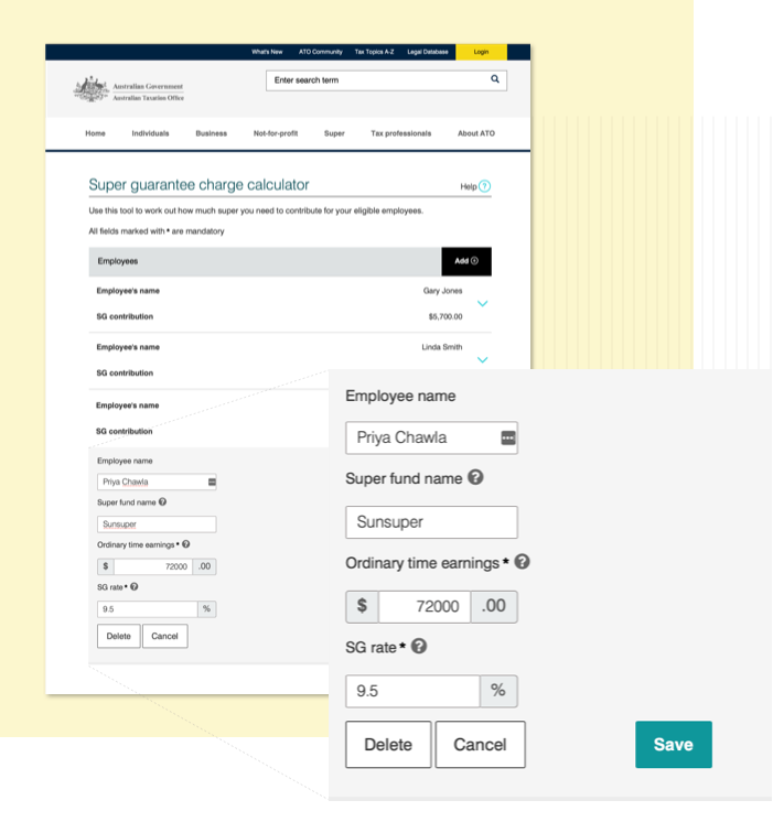
The service’s functionality requirements included: saving data and resume a
transaction within a set timeframe across different devices; calculation of amounts
due and the due dates, and presenting users with electronic payments options to
encourage early payment of the debt.
My mission: project prototype, people and papers
As the project’s UX Design Lead, I managed:
the technical aspects of developing a high-fidelity HTML, CSS and KnockoutJS
prototype;
documenting a interface specification (including functionality requirements,
information architecture, visual and interaction design, CARR diagram specifying
visual-states, business rules and validation); and
assessing the service’s compliance with accessibility guidelines (WCAG 2.0
AA).
Reducing complexity with progressive disclosure
As products and services become more complex, information excess and choice overload
can bombard users and drive poor experiences. By only exposing features and content
that need to be seen, the user’s cognitive workload is reduced.
‘Progressive disclosure interactions’ lead to better understanding,
shorter completion times, fewer mistakes as well as a simpler and cleaner user
interface.
Users of government services usually have a task that they need to do as quickly as
possible; they don’t want to spend time understanding what’s relevant to
them in a service. As a legacy platform targeting a browser on a desktop device, I
anticipated challenges meeting accessibility requirements and limitations in the
portal’s codebase for supporting a mobile experience. However, ATO’s
preference for progressive disclosure meant the project’s overall UX approach
was pointed in the best direction from the start.
Progressive disclosure helped user
focus .
Separating business logic from design markup with SPA
I used the Single Page Application (SPA) architectural pattern to build a prototype.
SPA separates the user interface from business logic through a middle layer that
dynamically updates data from the business layer to the UI while pushing
interactions from the UI back to the business layer. For example, the business layer
would calculate complex superannuation liabilities based on user-entered amounts and
dates, and display them back to the UI—without needing to refresh the UI. The
separation would also improve maintenance of the service, by enabling future design
improvements without touching business logic.
An end-to-end journey that maintains user focus
From an end-user’s perspective, SPA improved system performance with faster
loading screens and fewer screen loads as screen elements could be updated ‘on
the fly’. The end-to-end journey would simply render as different views on a
single screen, rather than a number of discrete web pages downloaded from a server.
User testing validated that this approach reduced latency and maintained user focus.
Form completion time duration was significantly reduced over the existing form,
assisted by calculations performed by the application’s business logic.
Functional prototyping in real time
I then used SPA to speed further iterations. In contrast to traditional “smoke
and mirrors” prototyping applications, the functional elements could be
dynamically added or updated on screen, simply requiring a change to the markup of a
single page of html and its javascript file containing the business logic.
WCAG workaround
My assessment of the prototype against the WCAG 2.0 AA accessibility level identified
that all new elements met the standard. However, the legacy elements of each view
(i.e. the master page header and footer) were not compliant. Although these were out
of scope for the project, I put forward a balanced option in my accessibility
report—to redevelop these legacy elements while keeping them quarantined from
the rest of the site. This recommendation ensured compliance for the service while
minimising retesting and risk across the web site.
A test bed for ATO’s journey to ‘single page’ architecture
The prototype was reused for build, dramatically reducing development times and
keeping costs well under control for the client. The ‘same screen, different
views’ approach can be seen in ‘myTax’ and other ATO services,
with this project seen as a successful test bed for the ATO’s transition to
‘single page’ web application architecture.
Client:
ATO, Brisbane
Tools and methods:
HTML, CSS, KnockoutJS prototype
Accessibility recommendations for meeting WCAG 2.0 AA
User interface specification document: functionality, information
architecture, visual design interaction design, screen elements
(CARR diagram specifying visual-state, business rules and
validation).
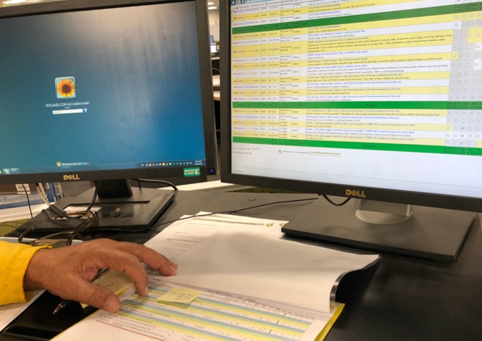
OPTIMISING AUDIT REPORTING
Exploring the art of the possible for extracting key
information from internal audit reports by executive managers
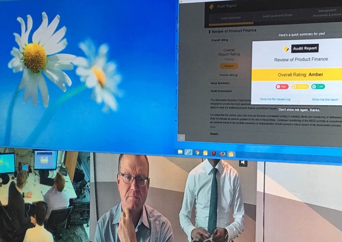
A proof-of-concept Tableau dashboard
provided insights for new designs.
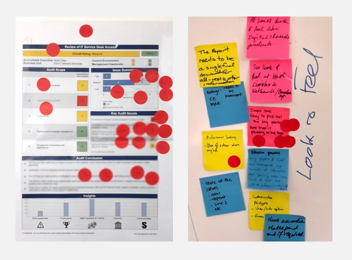
Manual paper reports failed to meet customer needs
The bank was looking for a way to move away from the manual collation and printing of
internal audits for internal customers. These reports provided too much detail,
failed to highlight key indicators and lacked consistency across templates which
hampered the comparison of information. The complex concepts needing to be conveyed
were challenging to communicate on paper reports, which weren’t shareable in a
format suitable for meeting the bank’s compliance obligations with external
auditor.
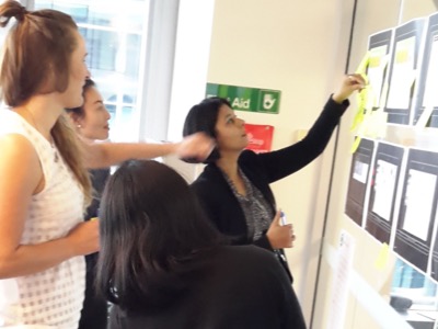
Audit team feedback, including a
remote session with Bankwest's team in Perth (right).
Exploring the art of the possible
From the outset it was clear that accessing the users (internally based executive
general managers and similar) would be challenging until later stages of usability
testing. I had proxies from within the bank’s Audit Team stand in for them
over much of the engagement, as they had intimate knowledge of target-user needs. I
took them on a five-week design-thinking journey, exploring ways of reimagining the
bank’s internal audit reporting system—using a
‘green-fields’ approach to allow for greater innovation. Design options
at the end of the engagement were to be used to shape product development.
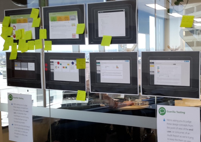
Concepts were displayed in office
areas for 'guerilla' feedback.
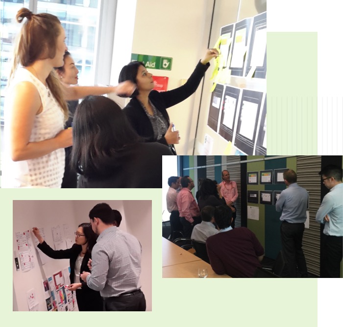
Design-thinking activities with purpose
I structured a series of iterative, co-design workshops around the key stages of
‘empathy, definition, ideation, prototyping and testing’. This approach
is systematic and broad—it allows for assumptions to be challenged, problems
to be redefined, and the ideation and testing of innovative responses.
I selected a variety of activities for the co-design sessions, each providing
valuable insights and learnings. Some are outlined below.
(Empathy) Reviewing and observing users interacting with a proof of concept
Tableau dashboard to understand its value and collecting insights on client
expectations. This exercise provided early indication of what the users wanted
to see in an audit report:
Concise use of language and logical order of elements such as the audit
conclusion high in the order with audit scope assigned lower.
Avoid an overly interactive and potentially confusing interface;
interactive relationships between data sets should be obvious.
Data filtering were accelerators to find key information, however,
preset filters initially reduced understanding.
Preference for content to be kept to a minimum.
Given the sensitive nature of the reporting, the sharing feature
generated valuable discussion.
(Definition) ‘Rose-Thorn-Bud’ to categorise data as positive,
negative or having potential, which facilitates valuable analysis, reveals key
focus areas, and allows next steps to be planned. These sessions captured
requirements for needed features such as ratings, export, filtering information,
drill downs, tiled content, branding and search.
(Ideation) Reviewing collections of digital design trends presented in
‘mood board’ posters, then group sketching and presenting possible
solutions to problems identified in Rose-Thorn-Bud sessions. Group voting to
short-list options deemed most fit for purpose.
(Prototyping) ‘Sketch it’ sessions refined and tested workshop
concepts quickly with the Audit Team. These underwent further refinement into
‘wireframes’ (blueprints of potential digital interfaces) created
through a lens of best practice usability. Once validated, the resulting
wireframes were linked together as a clickable prototype using professional
tools including Axure.
(Testing) As well as ‘on the fly’ testing with the Audit Team
thoughout early prototyping, I performed wider “hallway testing” to
engage with employees for additional input. At the clickable-prototype stage, I
undertook formal validation testing at the bank’s Innovation Lab,
involving behavioural observation of real users to ensure that interfaces met
the key requirement of enabling decision makers to explore important data and
key factors at the optimum level of detail.
Usability testing was undertaken
in the bank's own testing lab.
Strong user buy-in
The five-week collaboration established the strong preference for digital
reporting over paper, providing further impetus for the project overall. User
testing of the high-fidelity prototype demonstrated the benefits of its
drill-down interactions, with executives able to quickly navigate around the
dashboard overview to information on critical issues and understand
underlying reasons for a particular rating. Given that ratings influenced their
KPIs, executives found the ease of use in this functionality invaluable. By the
end of the engagement, the product development stage was primed to build on a
robust, evidence-based foundation and strong user buy-in.
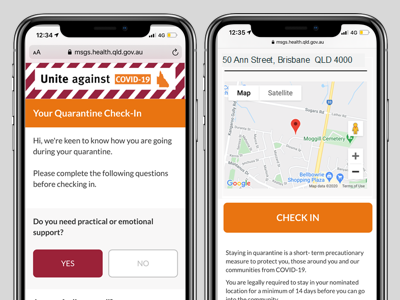
Revolutionising compliance monitoring during a pandemic
Case snapshot: modernising quarantine compliance
When faced with the critical task of monitoring COVID-19 quarantine compliance during a global pandemic, three
Queensland Government agencies co-developed an innovative, digital-first service. Queensland Health partnered with
Queensland Police, the Department of Justice and Attorney-General (JAG), and Smart Services Queensland (SSQ), to
collaboratively design and implement the Home Quarantine Check-In Service. This mobile-based solution utilised SMS
check-ins, geolocation checks, and short health questionnaires to enable compliance monitoring at scale, while
reducing strain on resources. The check-in service also provided information and support to quarantined people,
while maintaining public trust and safeguarding privacy.
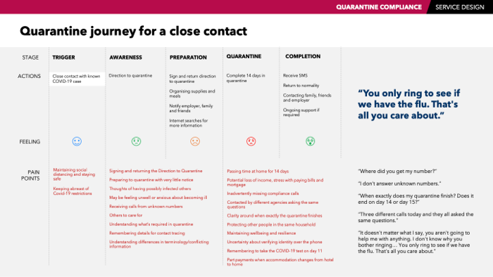
A multitude of pain points were identified in the existing journey for close contacts.
Problem statement: bridging compliance gaps
Existing processes for quarantine compliance monitoring involved regular phone calls and on-site police visits. This
approach during a pandemic would divert police resources from critical tasks and risk insufficient detection of
non-compliance.
The state required an efficient and scalable solution, to meet anticipated quarantine surges and help stop the
spread of Covid-19.
Users and audience: empowering citizens and authorities
The primary users of the service were:
quarantined citizens—international and interstate arrivals, close contacts identified through contact
tracing,
and those directed under public health legislation to quarantine, and
government agencies—coordinating a multi-agency program for efficient and effective quarantine regulation.
Scope and constraints: rapid delivery in a high-stakes environment
As a Customer Experience Specialist at the Department of Justice, I led the project service design in
collaboration with stakeholder agencies. The team had to deliver a functional proof of concept for a
mobile-based check-in system, within four sprints over eight weeks. User trust and acceptance was critical.
Lockdowns created access restrictions to end-users, so the team relied on desk research and proxy testing to
inform decisions.
Additionally, the integration of a third-party bulk messaging system, Whispir, posed a constraint, as the team had to
quickly come up to speed with the Message Builder system. This included navigating the limitations of the drag and
drop component system while ensuring compliance with Queensland Government branding guidelines.
The service was designed to meet the citizen's trust before progressing to more substantial interactions.
Process: crafting a seamless quarantine check in experience
Empathy and Research
Designing the Home Quarantine Check-In Service involved a user-centred and iterative approach to address the complex
requirements of compliance monitoring.
The process began with comprehensive scan of quarantine compliance initiatives implemented across the world. This
research also delved into the psychological factors that drive adherence to public health directives, providing
valuable insights into the motivations and behaviours of quarantined individuals.
Through collaboration with government departmental stakeholders—mapping and engaging relevant parties, establishing
clear communication channels, organising co-design workshops, and developing an approach for usability testing—I
identified critical pain points in the existing quarantine journey. These included gaps in monitoring, challenges
faced by users preparing for quarantine at short notice, uncertainty about requirements during quarantine, missed
compliance calls, redundant calls from multiple agencies asking the same questions, and a lack of clarity regarding
the end of quarantine. These findings informed the creation of a more citizen-centred service design (see box,
“TAKEAWAYS - effective citizen experience in quarantine”).
Definition and ideation
In previous projects, I have successfully run workshops with stakeholders to define service requirements and explore
potential solutions. For this project, I applied the same approach, conducting stakeholder mapping to identify all
relevant parties and persona development to represent different user groups and their unique set of circumstances.
We mapped the customer journey to understand touchpoints and their pain points, and created a service blueprint to
visualise the entire process.
During brainstorming and ideation sessions, we used techniques such as Creative Matrix, Round Robin, and Affinity
Clustering, to generate and test a wide range of ideas. These methods are designed to helped participants to observe
human experiences, analyse challenges, and ideate solutions.
Ongoing co-design sessions allowed stakeholders to collaboratively develop and refine service concepts. I then
created low-fidelity prototypes, such as sketches and wireframes, to quickly test and iterate on ideas. Ongoing SWOT
analysis helped evaluate the proposed solution so the development team could strategically plan and implement a
quarantine monitoring service that was robust, citizen-friendly, and effective in ensuring public health compliance.
Dot voting was used to prioritise ideas based on stakeholder input and feasibility.
Throughout these activities, we gathered feedback and iterated on the solution design and SMS message content to
improve and refine the service.
During these sessions, I developed principles aimed at creating a compliance experience that highlighted the benefits
and value of adhering to quarantine, minimised the introduction of new pain points, balanced the use of altruistic
language with necessary penalties and warnings, prioritised earning citizens' trust before demanding more from them,
and adhered to Queensland Government customer-first principles.
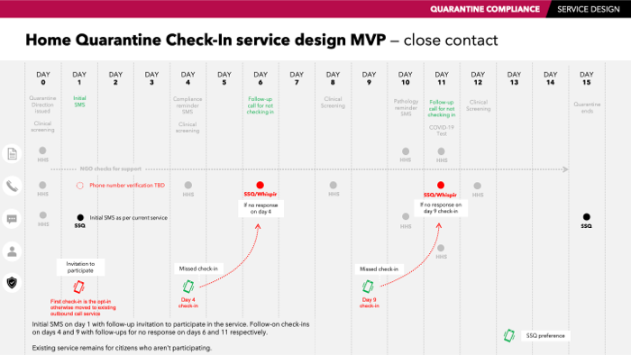
Prototyping
The iterative prototyping phase translated these concepts into practical interfaces, integrating features like
geo-location tracking, streamlined SMS check-ins, and health reporting tools.
Validating and testing
Validation and testing were crucial to ensuring the effectiveness of the solution. Whispir’s service enabled high
quality, rich content messages for SMS and web to be quickly built and tested from wireframed concepts. Internal
testing with proxies refined the design, while a test environment of the built solution was shared with stakeholders
for further validation. These steps ensured the final product was user-friendly, met compliance goals, and addressed
stakeholder needs.
Mobile compliance check-in was inserted into the begining of the existing quarantine journey.
Check-ins were quick to complete, making it easy for users to be compliant.
Outcomes and lessons: Building a resilient solution
Improved compliance: The service reduced non-compliance through automated check-ins and geo-location tracking,
enhancing public health safety.
Resource optimisation: Queensland Police and Smart Services Queensland experienced a significant reduction in
manual monitoring efforts.
Community impact: By containing COVID-19 outbreaks more effectively, the service safeguarded both public health
and trust.
Lessons Learned
Iterative design is key: Agile methodologies allowed rapid delivery of a user-friendly solution within a
constrained timeline.
Collaboration drives success: Multi-agency cooperation and stakeholder involvement were critical to aligning
diverse needs.
User-centric design enhances adoption: Simplified processes and clear communication ensured high user
engagement.
Conclusion: A Blueprint for Scalable Solutions
The Queensland Home Quarantine Check-In Service exemplifies the benefits of design thinking and cross-agency
collaboration in addressing complex challenges. By harnessing digital technologies, the project not only achieved a
critical public health objective but also established a new benchmark for scalable compliance solutions.
TAKEAWAYS - effective citizen experience in quarantine
Reinforce benefits and value of compliance
How the service will benefit them? Emphasis altruism, cost savings by not being in secured-quarantine and helping
manage freedom of movement.
Ease the pain points of quarantine by not creating new ones
Make it easy to be compliant and quick to do. Provide a good user experience. Eliminate unnecessary steps due to
‘inside-out’ service design.
Balance not going over the top with people who commit to doing the right thing with not going easy on those who
don’t
Dampen the “taking control” and “feeling oppressed” sensibilities, and strengthen the “thinking morally”
sensibility. Balance altruistic language with penalties and warnings.
Meet citizen’s basic trust needs before progressing to more substantial interactions
Focus on citizen’s needs in gaining their trust before asking for more personal information such as location, or
admitting to a breach.
‘Be clear’, ‘Be helpful’, ‘Make it easier’ and ‘Do what you say’
Queensland Health, Department of Justice, Queensland Police, Smart Services Queensland, Brisbane
Tools and methods:
Stakeholder mapping, persona development, journey mapping, service blueprinting, HCD techniques, prototyping.
Transforming Queensland's jury management system
Queensland's Digital 1st Strategy enables court
reforms, modernizing jury management for streamlined, citizen-focused service
delivery.
The Queensland Government's Digital 1st Strategy drives a digital-first
approach to transforming public sector service delivery for the Sunshine State. In
line with this strategy,
Court Services Queensland, responsible for providing administrative support to the
state's courts,
embarked on a project to modernise its jury management processes.
A key initiative within this transformation involved replacing the outdated and
unsupported Queensland Jury
Administration System (QJAS) with a new, more efficient juror management system.
This upgrade aimed to enhance
the experience for Queensland citizens called for jury duty by streamlining the jury
selection process and
improving convenience, in a more modern, citizen-centric approach.
Securing a supply of jurors for justice services in Queensland
Queensland Courts faced significant challenges in ensuring an adequate supply of
jurors for trials. Each year,
approximately 380,000 jury eligibility questionnaires were mailed out, resulting in
30,000 summonses and only
8,500 jurors being successfully empanelled.
In Brisbane, an average of only 5% of recipients were being secured for jury duty.
The existing mail-based system
for determining eligibility suffered from low response rates, with many people
either forgetting or choosing to
not respond. Further, insufficient follow-up or tracking mechanisms meant that
penalties for non-response were
not being enforced.
In addition to these challenges, the payment method for jury service via cheque was
outdated and inconvenient,
further contributing to a poor user experience and discouraging participation.
The key aim for this project was to increase citizen engagement and participation in
the jury process, by
simplifying interactions, offering multiple channels for communication, and
modernising juror payment systems.
The new jury management system also had to be adaptable for continuous quality
improvement into the future.
Project personas reflecting a wide
user base.
A very broad user group facing multiple barriers
The state's jury management system must serve a wide and diverse user base,
consisting of any member of
the public randomly selected from the Queensland Electoral Roll, as well as courts
staff.
Several factors discouraged people from engaging with the system. There was no
convenient way of completing
the juror form online, requiring the summonsed juror to complete a paper form and
return it by mail.
Recipients of jury service notices often lacked a clear understanding of what was
required of them, the
selection process, and their employee rights regarding participation. The
authoritarian tone of the notice
letter led many to believe they were in trouble with the law.
These management system barriers were compounding wider difficulties—with jury duty
itself. Finding time to
fulfill jury service obligations around other commitments and plans can be difficult
for many. Inadequate
financial incentives or compensation make attending jury duty less appealing, while
the threat of penalties
for non-response caused significant concern.
Unique project constraints
Limitations due to the Jury Act 1995 meant that special permission needed to be
sought from a magistrate
court judge to speak to a small number of jurors as part of the user research.
Summonsing processes meant
that these jurors could not be secured in advance for user observations, but rather,
these activities had to
be stood up at a moment's notice, and were further disrupted by COVID-19
lockdowns.
Setting out in the scrum team for the new Juror Portal
I was the Customer Experience Implementation manager within the project's scrum
team of nine. I was
responsible for mapping and validating the current state journey pain points for
internal and external users
through workshops with representative SMEs from across the organisation. I was to
improve external (juror)
personas, re-workshop if necessary, and use alternative research to bolster the
limited and unreliable
access to jurors. This work was to further understand the needs, motivations and
behaviours of jurors, then
take these insights to advise on the user experience for the digital service design
of the new Juror Portal.
Applying customer experience activities
Throughout the project, I adapted user observation and enquiry activities to comply
with strict jury
protocols, and applied my service design lens to broader challenges such as the
courts' reliance on
citizens' civic duty and the threat of fines for non-compliance.
I developed a schedule of customer experience (CX) activities to better understand
the challenges faced by
both jurors and court staff when interacting with the jury process. I undertook
observational research
during court sitting dates, facilitated workshops with court staff to build a view
of typical jurors and
their journeys, so I could map the diverse experiences of those interacting with the
jury system and develop
a suitable range of personas.
The journey maps illustrated the highs and lows of the experience, service gaps and
areas where the service
needed improvement to address juror pain points. Personas (see box) reminded the
team of the complexities
and diversity of our audience, ensuring that both internal staff and external users
were represented in the
design.
Jury service journey map for
"Purposeful Peta" persona.
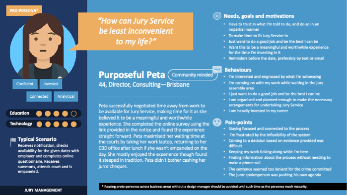
I helped visualise a future vision for a modernising the jury process, ensuring the
development and
progress of the juror portal was maintained and shared through platforms such as
Miro. Based on these
insights, I prototyped a digitally assisted jury service experience, keeping the
needs of participants
at the core of the solution.
"Purposeful Peta" persona.
Outcomes and lessons
One key takeaway from the project research was the need to remind prospective jurors
that jury
service offers citizens a once-in-a-lifetime opportunity to engage in a crucial
civic duty.
Encouraging reminders placed at key moments in the service, such as after logging
into the portal,
could help reassure prospective jurors of their valuable citizenship. Interestingly,
bigger
questions arose that went beyond the project's scope, such as how the
organization could help
prospective jurors place greater value on their citizenship and role in the justice
system.
The formality of the justice system often creates unease for prospective jurors, who
must navigate
complex expectations around impartiality, mindful behaviour, and the serious subject
matter of
trials. Additionally, jurors are influenced by media coverage, which can shape their
perceptions of
the justice process. For some, attending court daily for several weeks without being
selected for a
trial can leave them feeling disconnected or undervalued, further affecting their
experience.
While addressing these pain points was outside the scope of the project, it served as
a reminder of
the importance of making juror touchpoints experiences as seamless as possible, such
as:
communicate clearly by using simple, conversational language;
provide certainty with penalties involved with adequate messaging, updates and
confirmations;
answer questions before they ask them – remind and instruct jurors about
the next thing to
happen, and at the right time.
ease of use – don't ask for known data, or expect users to make up
for limitations
in the system;
task oriented – understand juror needs and goals, and minimise the steps
required to
achieve those goal;
mobile first – let high mobile usage guide the format of future
interactions;
Always be consistent – apply best practice and comply with Queensland
Government
Consistent User Experience (CUE) standards for digital services.
User benefits
The new juror management system streamlined the process, making it easier for
potential
jurors to navigate the various stages of their journey. Eligibility is now
determined via an
online questionnaire sent alongside the Notice to Prospective Juror, and those
deemed
eligible are entered into a second random selection process. This creates a pool of
potential jurors who can be called upon during sittings.
By gaining insights from stakeholders and jurors alike, the project ensured that the
customer
experience was central to service improvements. The new system made the process more
transparent and efficient, enhancing the overall experience for citizens while
improving the
court's ability to manage juror participation. For example, the portal provided
clear,
step-by-step guidance and messaged timely reminders, reducing confusion and anxiety.
It also
offered a dedicated support section with FAQs as well as payment claim
functionality,
ensuring jurors felt supported and rewarded throughout their service.
A persona alternative
The COVID lockdowns and subsequent suspension of jury services posed a challenge in
verifying
early personas with real jurors. To overcome this, we devised alternative methods to
build
out these personas, and in the process, created additional personas that had been
previously
overlooked.
Since the initial personas were based on anecdotal evidence, we referred to them as
“proto-personas”—formative, untested versions of how the final personas
might
evolve. Proto-personas served as a valuable tool for aligning stakeholders and
giving the
design team a clearer understanding of the people navigating the new service.
However, I
ensured that the use of proto-personas was managed carefully, emphasising that they
should
only be reused with caution and by experienced design practitioners until they
reached
maturity.
Keeping personas up to date
Conduct ongoing qualitative research
Regularly engage in user testing, interviews, and observations to validate
and
refine
proto-personas.
Continuously gather insights to ensure personas accurately reflect real user
needs.
Regularly update personas
Update personas based on new insights as the project progresses.
Adapt the service to better meet evolving user needs.
Integrate research activities
Incorporate activities like exit surveys into the jury service to monitor
and
enhance user
experience.
Use survey data to align responses with personas, revising or removing less
relevant
personas and refining those with higher alignment.
Assess personas against project goals
Frequently evaluate personas to ensure they align with project objectives.
Stay flexible and ready to adapt personas as needed.
Promote persona usage within the organization
Encourage the use of personas to foster a customer-centric culture.
Use specific personas by name during service walkthroughs to provide context
and
help
stakeholders visualize the target user.
Embed personas into service design
Continuously refine personas and integrate them into the service design
process.
Aim to deliver a more responsive and empathetic system tailored to the
diverse needs
of
jurors and court staff.
By following these steps, an organization can maintain up-to-date personas that
drive a more
customer-centric and effective service design.